We all get a strange vibe when we encounter poor design. Whether it’s a user interface, a workflow or something as seemingly simple as a switch. Poor design frustrates us, angers us, limits us. We want to do something and we can’t. And we feel like it’s our fault. How can I be such an idiot and not know how to make this work. No, you can’t! The fault is not yours but a bad design in which the fundamental principles of interaction have not been used.
Some examples that I’m sure you’ve experienced first hand:
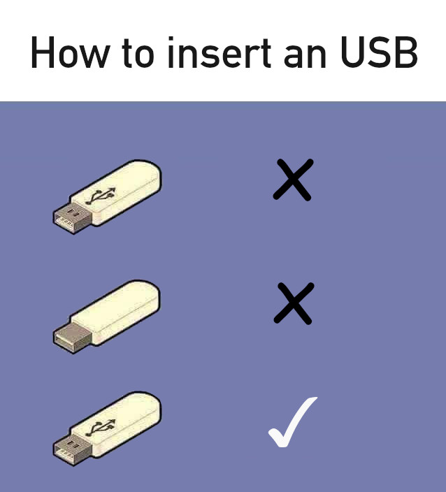
- That USB that you tried to connect two times and it didn’t work until the third time. Luckily solved with the marvellous invention of USB C.
- That key with which you try to open the door and it doesn’t fit at all… Ah, it turns out it was the other key…
- That switch that always turns on the light you don’t want to turn on.
- That button that you’ve pressed five times and still won’t send the form…
If things as seemingly simple as the lights in our own house give us so much trouble, it is no wonder that when we use any software such as web services or mobile apps sometimes we feel lost.
These types of products are usually designed by engineers, experts in their field, sometimes without even taking into account that the end user may be someone else.
Experience-centred design
The best designs are not marked by the best functionality or the fastest speed (which is also true) but by providing the end user with a pleasant user experience. Yes, this is very subjective, but each person will use our design in a different way. This is due, as we will see later, to the fact that everyone has their own mental model of our product.
We will have to take into account different factors that make our design comply with a series of fundamental principles in order to provide the experience that the user of our product or service expects to have. This means that our design has to allow the user:
- Discover the functionalities of our system, either on its own through its afordances or through the signifiers we add during the design.
- The user should feel like an expert, who knows and understands what is being done at all times, so our product must present a correct mapping of the functionalities, present a clear feedback of his actions and allow him to elaborate a right conceptual model of how our system works.
- And of course, a clear reading for which we must take care to present everything in a clean, pleasing to the eye and accessible to all (future link article on accessibility in design).
Afordances, signifiers, mappings… let’s go for parts….
Affordances
The term afordance (from to afford) refers to the relationship between the properties of an object (e.g. an interface) and the user’s ability to determine the ways in which this object can be used. It is the different qualities of an object that make it possible to define the functions it has from its appearance. The existing afordances depend on both the design of the object and the knowledge of the user.
In the case that the afordances cannot be perceived in a direct way, it is necessary to signal them. To do this we will have to make use of signifiers. On the other hand, it is possible that afordances appear of which the designers are not aware, and it is the end user who gives an unexpected use to our product.
Signifiers
As designers we always have the practical problem of how to design tools that are easy to understand. Luckily, and to make things easier for us, we can (and should) make use of signifiers. While afordances determine which actions are possible on a given interface (e.g. tapping on the mobile screen), signifiers communicate to the user where the action is to take place (e.g. the drawing of a button).
Signifiers, therefore, are any mark, sound or other indicator perceptible to the user that communicates what the user’s behaviour should be at a given moment. From a simple “click here” text, the underlining of links, the icon of a shopping cart, to more sophisticated animations that explain the first steps in an application.
On the contrary, an excessive use of these elements and their application to define simple functions is an indicator that our design is deficient. We must also be careful with the use of false or erroneous signifiers that may indicate to the user a functionality that does not exist (such as underlined text that is not a link).
Mappings
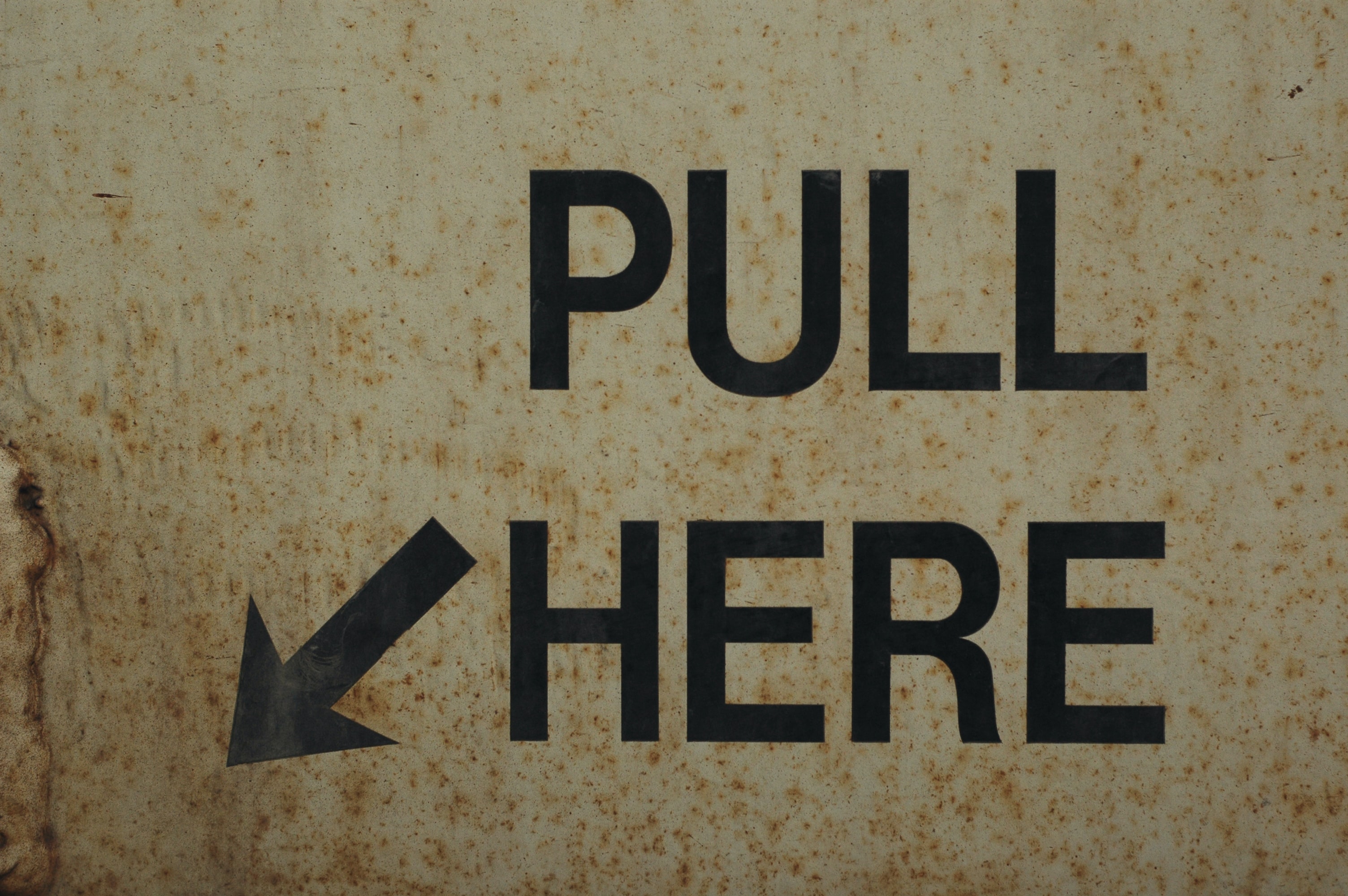
When we talk about mapping in design, we refer to the relationship between different control elements (e.g. room switches), the elements they operate (room lights) and the way in which they do so (turning on, turning off or adjusting the intensity of the light).
A proper use of mappings makes our user interface easier to learn and use. To do this, a logical relationship must be established between the controller, the actions it performs and the result expected by the user. For example, it is common to use the Esc key to exit or Enter to send a form, etc.
In the case of complex interfaces, techniques such as grouping elements with similar functionalities (e.g. in drop-down menus) or the proximity of the controllers to the elements on which they act must normally be used.
If possible we should use natural mappings, otherwise the user of our product must have a correct mental model of how it works. In addition, natural mappings will usually make our application easier to use.
Feedback
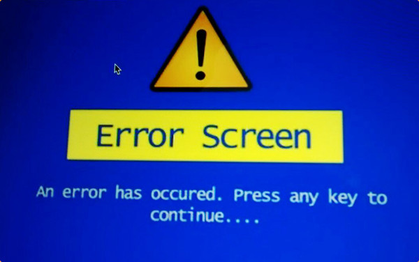
If you have ever clicked the same button to submit a form several times to make sure it has been submitted, you have encountered a design where the feedback principle has not been taken into account.
In order for the feedback of our designs to be functional, it must be:
- Immediate: since the slightest delay in a response can be disconcerting for the user.
- Short: you should avoid making the user wait, especially in the case that after performing a certain operation the user may get an error.
- Informative: if the action requested by the user requires a long period of time for its execution, it is advisable to provide additional information on the status of the process. In addition, the messages presented should be clear and easy to understand by the user. In the case of errors, they should provide the necessary information for their resolution.
- Not excessive: overwhelming the user with messages constantly is also a very bad idea. It produces an unnecessary distraction and makes the main task of our tool take a back seat. It can also cause the user to ignore all messages, including the most important ones.
- Hierarchical: the most important communications should be highlighted (e.g. in red) so that they capture the user’s attention. On the other hand, less relevant information for the user should be presented in a way that interferes as little as possible. If several critical messages can be given at the same time in our system, we must also be able to establish a correct prioritization for each of them.
If we do not comply with these rules, if the feedback system for our product is poorly designed, it may sometimes be better not to provide any information to the user at all.
Conceptual model
Finally, our user must to understand what he is doing when using our product. For this, she must have a conceptual model. Is the explanation that users gives to our functionalities and she’s idea about what our application does. Normally it will also be very simplified since it does not have to be complete or precise, as long as it is useful.
A good example of a conceptual model that we use on a daily basis are the notions of file and folder in our computer, which help us to understand easily how to save our documents in a certain location on our hard disk.
There can be different conceptual models for the same product. The representation we have as designers is not the same as the one a user may have. The conceptual models that we find in the technical documentation of many products are usually complex and detailed. The models we usually have in our heads are simpler and more intuitive. These are called mental models and are the ones we use when using any product.
Therefore, each user will have a mental model, and unless the user reads the documentation (assuming there is documentation) this will be formed through the keys obtained from the design of our user interface. For this we must correctly use all the elements already mentioned. We must correctly mark the afordances, signifiers, constraints and mappings so that the user gets a correct conceptual model of how our application works.
In case the user has an erroneous mental model of our product, he will have difficulties to use it and will also be more prone to make mistakes in the tasks he/she has to perform with our system.
Conclusion and further readings
Taking all these principles into account, a good design requires planning, attention to detail and above all understanding the way our users behave and the capabilities they have. They must make a correct mental model of the entire system or application through the design of the user interface. During conception we will have to apply all the fundamental principles of interaction.
To investigate in more detail each of the elements that make up the fundamental principles of interaction for the design of user interfaces I recommend Don Norman’s book, The design of everyday things. It is a classic and a reference for the design of any product.
Finally, it is worth mentioning that the origin of the term afordance comes from the field of visual perception. It was coined by James Gibson in his book The Ecological Approach to Visual Perception.